How to choose your brand’s fonts to attract more aligned clients & tips for choosing the perfect fonts for your brand
Filed in Small Business Tips

browse Business tips
explore my work
Categories
Small business and website tips, branding advice, client projects, and occasional tips that help you build a life you love while growing a more joy-filled business.
Join the Email Community
Expect small business, branding, and website tips, client website and brand projects, and occasional recommendations that help you build a life you love while growing your business — one filled with joy.
WELCOME TO THE WEB DESIGN + BRANDING BLOG FROM ARTISAN KIND
Building your brand is like building a puzzle. There are a lot of pieces that go into making the picture whole. And it may take some time to put it all together. Choosing your brand’s fonts is just another piece of the puzzle. Like your brand’s color palette, your fonts, when chosen mindfully, will help you grow your business by working to attract the type of clients you want to work with (and who want to work with you!). Let’s get into why fonts are so important and how you can choose the right ones for your brand.

What are brand fonts?
Your brand fonts should be completely different from the fonts used in your logo. Logos can be artistic and a bit abstract. If you happen to be using your logo font for more than your logo, don’t panic, but you’ll want to change that as soon as you can. Your logo is a special piece of the puzzle, and those particular fonts should be reserved for only your logo so as not to draw attention from it. Your (non-logo) brand fonts need to be cohesive, legible, and match your overall vibe. This specific group of fonts will be used on your website, business cards, blog content (headings, subheadings, body text, etc.), and your social media posts.
Why are fonts so important?
Much like the other elements of your brand, the fonts you choose should represent the vibe you want to give off when potential clients are interacting with your content. Fonts can influence your audience’s mood just as much as colors, which is why it’s so important that they’re chosen with intention. For example, if you choose an overused, handcrafted font like Papyrus, you will immediately be seen as non-serious and outdated (Learn from James Cameron’s mistake when choosing his font for the serious blockbuster film Avatar. The SNL skit featuring Ryan Gosling in the video below drives this point home!
On the other hand, more serious fonts like Times New Roman communicate that you’re all business and little personality. When your potential clients are interacting with your brand, your font should match the mood you want to communicate while still being easy to read and true to your vibe. Your fonts (like your brand colors) will attract or repel potential clients. I know, repel sounds harsh, but remember, it’s a good thing. The point of designing your brand around your unique personality is to attract clients who align with you, and you can only do that by showcasing who you are at the core so they know what it’s like to work with you.
Storytime
When I visit my Grandma, I pass a now abandoned daycare center. You would never guess this place was a daycare center if it weren’t mentioned in the name. The sign out front is written in a font that looks more fitting for a poster of The Nightmare Before Christmas. The font evokes feelings of panic, unease, and creepiness. To top it off, the sign is black and crimson red (more about the importance of color in another blog). I know this is an extreme example, but I’m not kidding, this place exists! Are those the feelings you would want to feel as you drop your child off at daycare? Of course not! In reality, this place was probably a perfectly good daycare center, but subconsciously, they were repelling potential clients by not being mindful of the feelings their brand evoked.
Build trust.
Having a set of intentional fonts and using them throughout your brand’s marketing materials creates consistency, which is so important for finding new, right-fit clients and keeping your relationship with the ones you have. Consistent messaging is crucial to ensure that your audience knows what you have to offer, what it’s like to work with you, and ultimately, if you’re the right fit for them. It’s a green flag. It means you’re stable and you can be trusted. If your brand elements are all over the place, that will create confusion for your potential audience and cause them to move on to someone else that they see as reliable. Consistency is created with all of the pieces of the puzzle, including your color palette, fonts, and images.
How to choose fonts for your brand
So, what makes a perfect set of fonts?
Often, I come across brands with both too little and too many different fonts, so there is a harmonious middle ground to be had. Ideally, you should use 2-4 fonts consistently. The fonts should vary in thickness and usually be a combination of serifs and sans serifs fonts (serifs have tiny feet at the bottom/top of the letters, and san-serifs do not). Most importantly, your chosen fonts need to be easy to read! If your potential audience can’t read your content, they definitely won’t be engaging with your content enough to get to know you, and they won’t feel confident moving forward working with you.
Showcase your vibe.
The goal with your set of fonts is to communicate the vibe you want your brand to give off. How do you want your potential clients to feel when they’re interacting with your brand? Is your brand whimsical, calm, or more serious? Ensure the fonts you choose represent your brand’s personality (aka YOUR personality).
Create a hierarchy.
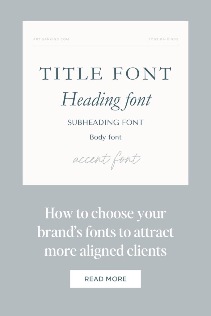
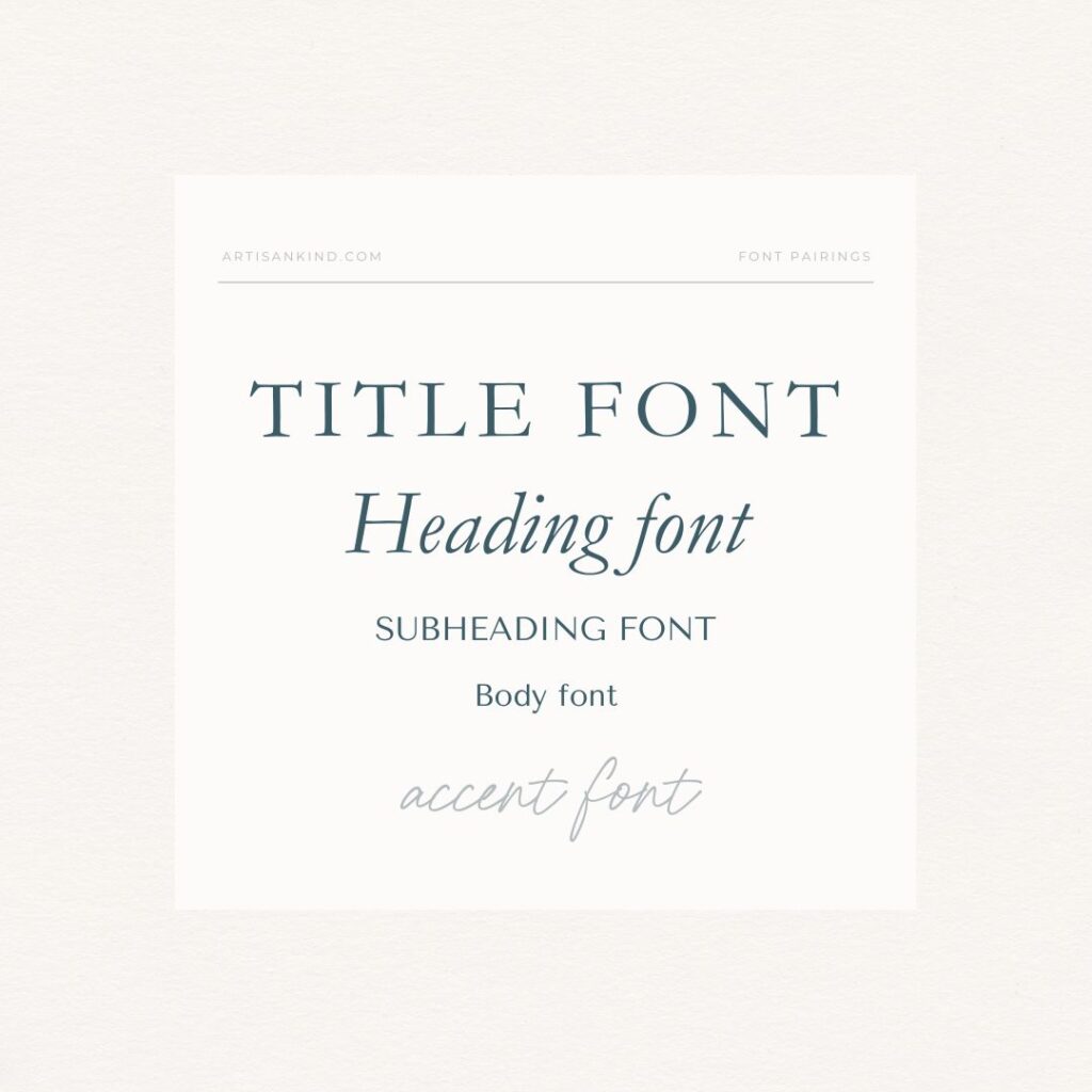
Another goal is to have enough options to create a hierarchy with a variety of fonts when writing content. For example, with your blog article, you need different fonts for your title, headings, subheadings, and body text (the blog you’re reading right now is a great example!). You’ll use fonts in different sizes to communicate the importance of certain sections and to make content scannable. Also, keep in mind that you can use the same fonts in different ways. You can change the weight (bold, light, heavy, italic), and you can choose to write in ALL CAPS (yes, you can do this without looking like you’ve written a Howler).

A note on script fonts.
You may also want an accent font for your website or social media posts. Typically, accent fonts are scripts, but those don’t always fit every brand and can sometimes be hard to read, so be careful. Always use font scripts sparingly, no more than one sentence at a time. Script fonts tend to be trendy, so they should be chosen carefully. They tend to become dated faster than other fonts, but that doesn’t mean you shouldn’t use them at all, especially if they fit your vibe.
Pro Tip
Even though it sounds a million times easier, do your best to resist the urge to use all system fonts or fonts that come pre-loaded in programs like Gmail, Canva, or Google Fonts. Yes, this may seem like a more convenient option, but it will make your brand look dated and blend in with the crowd, as they tend to be overused. Instead, try mixing and matching some carefully selected free fonts (Google Fonts has some hidden gems) with paid fonts. Picking unique fonts may seem like a task, but it’s so worth it. It will set your brand apart, give off the appropriate vibe, and help you grow your beautiful business. My go-to for font discovery is Creative Market. Personally, I use this site all the time to find quality, personality-packed fonts for my brand design clients. I often find them for less than $25 each, which is a steal for the overall impact.
How to pair fonts
When you’re choosing your fonts, keep in mind that you’ll be pairing them together. Deciding which fonts aesthetically go together can be difficult, so here is a quick tip on how to create a proper hierarchy. Think opposites. If you have a short, stout font, pair it with a taller font. If the font is chunky and bold, pair it with a slim font. As long as the title or header stands out and the body font is super easy to read, you’re on the right track.
Get support.
Like the other elements of your brand, fonts play a subconscious role in your business’s success and your ability to attract aligned clients, which is why it’s important they’re chosen mindfully. Not only do fonts help create consistency, but they also influence and attract your ideal clients. It’s totally possible to DIY this and get it right. It may just take a little time and effort on your part until you find the fonts that speak to you and your brand. If you don’t have the capacity to DIY your brand elements or all of this just sounds overwhelming, hire a brand designer (like me) to create a cohesive design backed by strategy.
One of the things my clients love about our work together is that I explain my design decisions like, I picked this font because it communicates this emotion that we identified as important. I find that my clients are much more likely to commit to their brand design and use it consistently when they understand the psychology behind what their brand elements are communicating.
If you’re ready to work together, Let’s connect. I’d love to help you build a brand that helps you attract more of the types of clients you dream of working with!

Aubre Walther is the founder of Artisan Kind, a website and brand design studio specializing in Showit websites that feel true to who you are. As an official Showit Design Partner, she helps service-based businesses like coaches, wellness professionals, and consultants build websites that attract right-fit clients through authentic design. Working from her 100% solar-powered studio in Eau Claire, Wisconsin, she creates clean, intentional websites that make potential clients feel an instant sense of connection. When she’s not designing, you’ll find Aubre tending to her cats and celebrating the small wins.
Explore Showit templates and design services at artisankind.com.
Small business and website tips, branding advice, client projects, and occasional tips that help you build a life you love while growing a more joy-filled business.
Join the Email Community
Download my step-by-step guide to crafting an enticing lead magnet so you can attract, nurture, and convert an interested audience into ideal clients.
Lead your audience from loyal follower to interested audience member to future client.
Let's create a website you'll be excited to send them to.
YOUR NEW WEBSITE + BRAND AWAITS
Let’s invite them in, so they can experience the joy of working with you.
Are you ready for a website that shares your magic with the world?
proudly designed in my 100% solar powered home studio
ARTISAN KIND LLC © 2024
proudly designed in my 100% solar-powered design studio | ARTISAN KIND LLC © 2025
Head Home
Meet your Designer
View Portfolio
Get In Touch
Book Discovery Call
Explore All Services
Custom Webs Design
Semi-Custom Web Design
Custom Brand Design
Shop Website Templates
Browse Favorite Resources
Free Website Assessment
Explore the Blog
Read Terms & Privacy Policy
Find Your Way Around
Small business and website tips, branding advice, client projects, and occasional recommendations that help you build a life you love while growing a more joy-filled business.
Email Community
join the
Every element of my website, copywriting, and designs has been thoughtfully crafted by real human hands and creative minds, ensuring your experience is personal, intentional, and authentically human!
An authentically human experience
Aubre Walther is a Showit Designer based in Eau Claire, WI, serving clients worldwide from a 100% solar-powered home design studio.
Creating websites & brands that make your potential clients feel an instant sense of connection and trust.