How to implement your new brand design to elevate your brand and create consistency
Filed in Small Business Tips

browse Business tips
explore my work
Categories
Small business and website tips, branding advice, client projects, and occasional tips that help you build a life you love while growing a more joy-filled business.
Join the Email Community
Expect small business, branding, and website tips, client website and brand projects, and occasional recommendations that help you build a life you love while growing your business — one filled with joy.
WELCOME TO THE WEB DESIGN + BRANDING BLOG FROM ARTISAN KIND
So you’ve invested in a brand design for your business, and you couldn’t be happier with the way the design reflects your vibe. The anticipation has built, and you’re ready to share your shiny new brand with the world in order to attract those dreamy, aligned clients. But before you get too excited, consider this: If you don’t implement your new brand design as your designer intended, you’re missing out on opportunities to create consistency and showcase your elevated brand. If you’ve gone through the design process with me, an experienced brand designer, you have all of the pieces necessary to consistently implement your brand at every customer touchpoint (aka every aspect of your business that your potential customers interact with, like your website, social media platforms, and emails. Showit (my go-to website platform) and Flodesk (my go-to email marketing platform) make it easy to implement all your branded elements seamlessly.

Essential brand design elements
When you work with me as your brand designer, I set you up for success with various design elements. The first is your primary logo, as well as a handful of variations of that logo. Logo variations allow you the flexibility to showcase your brand consistently in different places. For example, your primary logo will take up space, and it should be displayed where that space is available, like in the header of your website. A smaller version of your logo is still recognizable, but it can be used where space is limited, like in social media posts or email signatures. Another element is your full brand color palette, which consists of 6-9 coordinating colors. You’ll also have 2-4 brand fonts, as well as patterns and textures to create variety.
You’ll also receive a set of brand guidelines specific to your brand. These guidelines describe in detail how to use your brand visuals and what mistakes to avoid so that you can stay true to yourself and your unique brand. This is definitely something you’ll want to keep in your back pocket and pass along to your virtual assistant or social media manager. All of these elements are essential in order to successfully implement your new brand. If your brand designer didn’t create all of these elements for you, don’t panic, just fill in the missing pieces before introducing your updated brand to the world.
Dos and Don’ts of brand implementation
Once you have all of the pieces of your brand gathered, it’s time to put them to work to build the bigger picture. Your brand elements will be used in your website, social media posts, business cards, email signatures, and email marketing content.
Basically, where your customers (and potential customers) go, your brand elements should go. Every piece of content that your audience interacts with should contain a combination of your brand elements. Since your website is the most spacious and extensive, it will feature most or all of your brand design pieces. Social media is another great way to showcase your brand, but every single post won’t contain all of your elements (which is totally okay!)
Mistakes to avoid
As a brand designer, I see business owners make a few common mistakes when implementing their new brand. I want to preface by saying these mistakes are totally understandable. You were just given all of these beautiful new brand elements, and you’re excited to put them to work! But try not to overdo it. For example, don’t add your logo to every single social media post. It comes off as a bit excessive, and it can be overwhelming to your audience, so try to add it to your posts only once in a while.
Along the same lines, you shouldn’t use all of your design elements at once if space doesn’t allow. Try to give everything a little breathing room. If you try to squish elements too close together or push them too close to the edges of your content, your design will communicate chaos rather than the vibe you intend to give off. This could turn off potential clients and cause them to feel overwhelmed by your brand.
Keep in mind that some platforms, like the CRM Honeybook, don’t allow you to use all of your custom elements at once (and that’s okay!). I have personally used Honeybook in the past to communicate with my clients, and the platform didn’t allow me to upload my specific fonts, so I chose fonts that were similar and still make sense with my color palette and my brand personality.
I also see business owners, for one reason or another, who don’t use all of the brand elements they’ve been given. They unintentionally introduce new colors and fonts on social media because they use pre-designed Canva templates and do not bother changing the fonts and colors before posting. Your brand designer strategically selected these elements to paint a cohesive picture of your unique brand, so make sure you use them! Platforms like Canva make it super easy to upload your logos, brand fonts, and colors so that you have them at your fingertips for every piece of content you create (make sure to customize any Canva template you use with your unique brand). If you use colors or fonts that don’t match your brand, or break the pattern of consistency, you’ll cause a disconnect and cheapen your brand. Inconsistency creates a subconscious feeling of distrust in your potential clients. And who wants to work with someone that gives them a gut feeling that they can’t trust?
Storytime
Speaking of recognition and building trust, I recently met up with a good friend (and very first business coach) who was visiting from Philadelphia, and I mentioned how I hadn’t seen her in person since she was blonde and how I loved her new look as a brunette. Of course, I could still recognize her because I worked closely with her for months, but that got me thinking about how sometimes I have trouble recognizing people I’m less familiar with when they frequently change their looks. For example, one of my best friends would show me photos of her with one of her close friends, and I wouldn’t always recognize them because they frequently changed their hair. They also had a pretty wide fashion range. So, even though I had met her a handful of times, it was hard for me to recognize her. Basically, what I’m getting at is it’s hard to build recognition and trust in your brand if your image is inconsistent, which is why it’s best to always stick with your brand design.
Pro Tip:
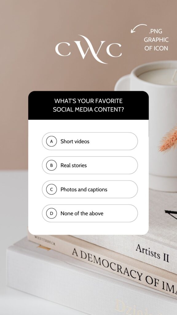
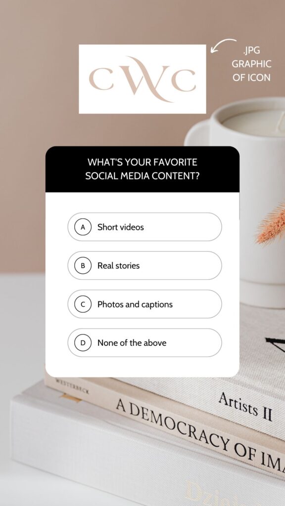
This mistake haunts my designer soul, PLEASE don’t repeat it! One of the most common mistakes I see business owners make when implementing their brand elements is using a JPG file instead of a PNG file. There are times you’ll want a JPG, but most of the time, you’re going to want to use PNG files. Why? Because PNG files have transparent backgrounds, allowing the file to seamlessly fit in with whatever branded content you’re creating. JPGs have white backgrounds, making them feel boxy and closed off.
See my example below of a branded Pinterest graphic. The first image uses a PNG graphic of this business logo icon; the second image uses a JPG graphic of the business logo icon. Notice how the second graphic feels cheap and clunky versus the first graphic feeling elevated and professional? Now that you’ve seen this, you won’t be able to unsee it in other businesses’ content.


At the end of the day, both you and your brand designer have worked hard to create a brand that you can feel confident in, so it’s important that you implement your elements accordingly and not miss the opportunity to give your new brand design the spotlight it deserves. If you find that you’re missing pieces, you likely didn’t receive a proper brand design or proper guidance on how to implement it. If you’re looking for a professional brand designer, I’d love to connect. Explore my services and book a call with me so we can work together to build you a solid visual foundation that feels like YOU.

Aubre Walther is the founder of Artisan Kind, a website and brand design studio specializing in Showit websites that feel true to who you are. As an official Showit Design Partner, she helps service-based businesses like coaches, wellness professionals, and consultants build websites that attract right-fit clients through authentic design. Working from her 100% solar-powered studio in Eau Claire, Wisconsin, she creates clean, intentional websites that make potential clients feel an instant sense of connection. When she’s not designing, you’ll find Aubre tending to her cats and celebrating the small wins.
Explore Showit templates and design services at artisankind.com.
Small business and website tips, branding advice, client projects, and occasional tips that help you build a life you love while growing a more joy-filled business.
Join the Email Community
Download my step-by-step guide to crafting an enticing lead magnet so you can attract, nurture, and convert an interested audience into ideal clients.
Lead your audience from loyal follower to interested audience member to future client.
Let's create a website you'll be excited to send them to.
YOUR NEW WEBSITE + BRAND AWAITS
Let’s invite them in, so they can experience the joy of working with you.
Are you ready for a website that shares your magic with the world?
proudly designed in my 100% solar powered home studio
ARTISAN KIND LLC © 2024
proudly designed in my 100% solar-powered design studio | ARTISAN KIND LLC © 2025
Head Home
Meet your Designer
View Portfolio
Get In Touch
Book Discovery Call
Explore All Services
Custom Webs Design
Semi-Custom Web Design
Custom Brand Design
Shop Website Templates
Browse Favorite Resources
Free Website Assessment
Explore the Blog
Read Terms & Privacy Policy
Find Your Way Around
Small business and website tips, branding advice, client projects, and occasional recommendations that help you build a life you love while growing a more joy-filled business.
Email Community
join the
Every element of my website, copywriting, and designs has been thoughtfully crafted by real human hands and creative minds, ensuring your experience is personal, intentional, and authentically human!
An authentically human experience
Aubre Walther is a Showit Designer based in Eau Claire, WI, serving clients worldwide from a 100% solar-powered home design studio.
Creating websites & brands that make your potential clients feel an instant sense of connection and trust.