


The Story:
Holistic nutritionists Jayne and Kelly bring together the lessons they’ve learned battling chronic illness and mind-body disconnect to return others to their quality of life. Their brand name, Abundant Hope Nutrition, is inspired by the bible verse John 10:10: “I have come that you may have life and have it in abundance.” To Jayne and Kelly, healing is not only possible…the paths to reaching it are truly abundant.
Jayne spent over six years battling crippling anxiety, depression, and brain fog that separated her from being present, let alone content, in her own body. Kelly found herself diagnosed with six autoimmune conditions by age 30 and endless days of exhaustion, brittleness, and symptom overwhelm.
Both refused to settle for this significantly impaired quality of life and sought answers. Both discovered that lasting healing was not found in quick-fix-pills but in their food choices and lifestyle habits. It sounds simple. However, finding the correct nutritional therapies and habit reprogramming takes support and patience. “Eating healthy” for one person may look completely different for another suffering from a different root cause.
There is no such thing as a “normal” person or a “normal” treatment. “Normal is only a setting on your tumble drier,” as Jayne says.
On individual journeys, Jayne and Kelly both found themselves pursuing higher education. They became certified holistic nutritionists. Jayne continued her training in areas of mental health and addiction recovery while Kelly studied autoimmune conditions and integrative oncology.
With mirrored lives and mirrored goals, their paths crossed, and they felt called to begin a partnered practice. Through Abundant Hope Nutrition, they guide others who are trapped by their health to a physically and emotionally stable place. They teach others how to fuel their system and recover from crippling symptoms by bringing awareness to the mind-body-nutrient connection.
The challenge:
Jayne and Kelly pursued brand design to become visible to those who suffer day in and day out as they once did. They understand just how valuable this work is, but know that it’s hard to land in the laps of the right people with so much conflicting information, intimidation, and generalized advice out there.
Those who feel at war with their mind and body are desperate to have their lives back. They are dysregulated and lack hope. It was essential that Abundant Hope Nutrition be presented in a trustworthy way. We settled on three brand attributes:
- Approachable
- Forward Thinking
- Expert
Approachable so that those in need wouldn’t feel even more overwhelmed pursuing help. Forward-thinking so that clients could rest assured that Jayne and Kelly were willing to turn over all the stones and stay open to possibilities. Expert so clients could feel safe, seen, and no longer fighting for answers on their own.
Jayne and Kelly’s ultimate goals were:
- A consistent pipeline of clients
- Meeting financial goals ($20K in new business each per month)
- Kelly would like a thriving, engaged, online paid community
- Jayne would like to have a successful online self-paced program, conference, and possibly a retreat.
- Long-term—to be the go-to nutritionists for those struggling with chronic health
The transformation:
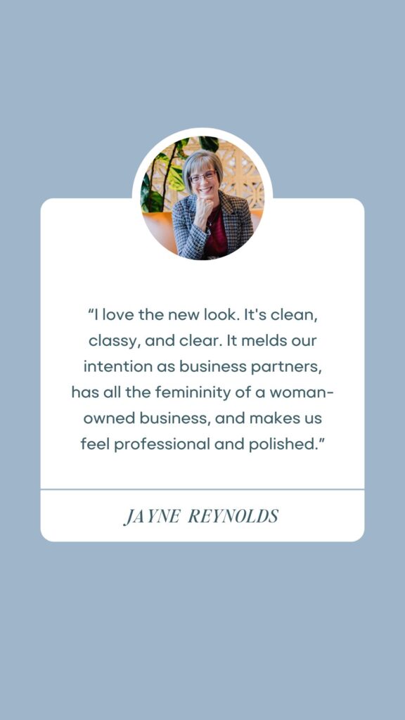
“I love the new look. It’s clean, classy, and clear. It melds our intention as business partners, has all the femininity of a woman-owned business, and makes us feel professional and polished.”
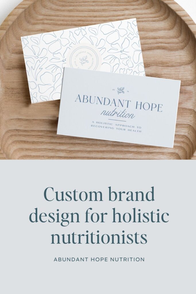
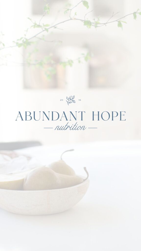
The Abundant Hope Nutrition design features a strong, grounded sans-serif logo. Why? Because “Abundant Hope” should be communicated in the way an outstretched hand and a firm hug feel.
The word “nutrition” is displayed in cursive lettering. Nutrition can be a touchy topic, especially for someone struggling with chronic illness…the light, flowing, emotive script for this part of the name tells a different story.
A delicate sprig of leaves tops the design, calling back to both Kelly and Jayne’s passion for wandering in nature, the peacefulness it brings, and the powerful medicine the Earth has to offer. Tools for healing exist all around us, small, delicate, and hiding in plain sight.
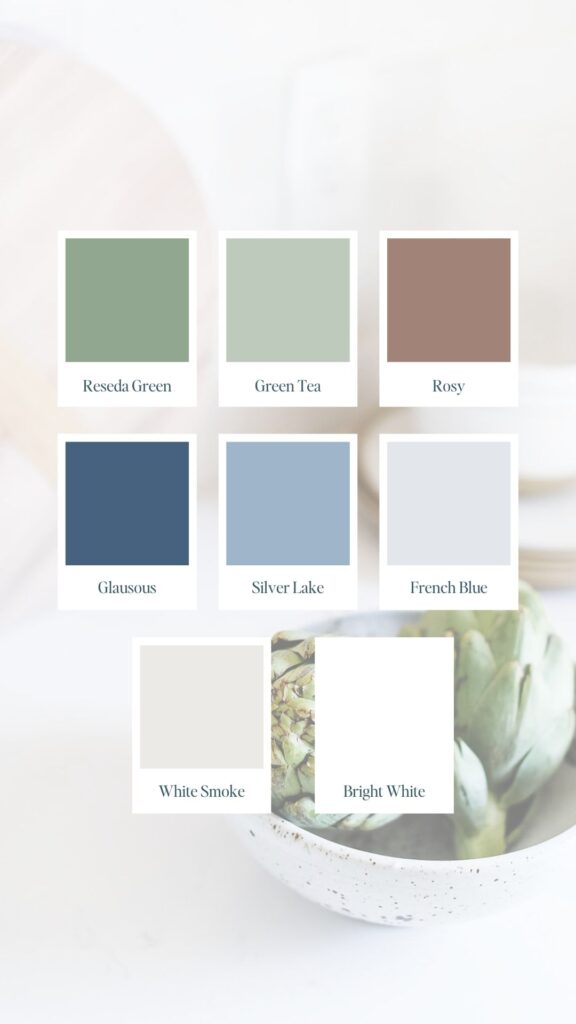
Cool and muted shades of blues, greens, and rose create a soothing and approachable atmosphere. The colors communicate expertise because they don’t need to be bold or vibrantly colored to attract attention. It doesn’t “scream at anyone,” as they noted in our strategic planning.
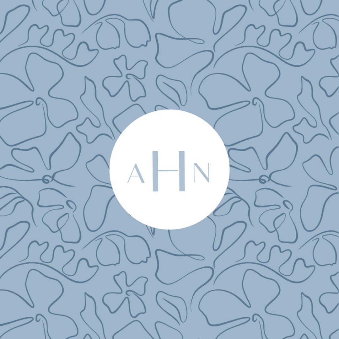
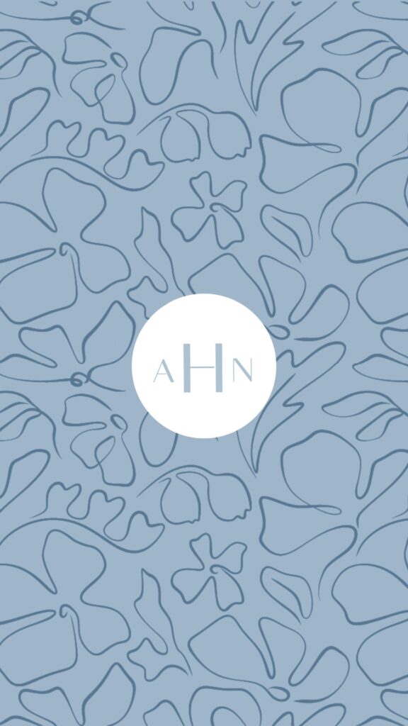
Patterns made of winding, abstract, and open-faced-florals create a sense of spaciousness. It communicates a desire to be flowing, explorative, and investigative of all of the twists and turns in a health story. This symbolism demonstrates forward-thinking practices.
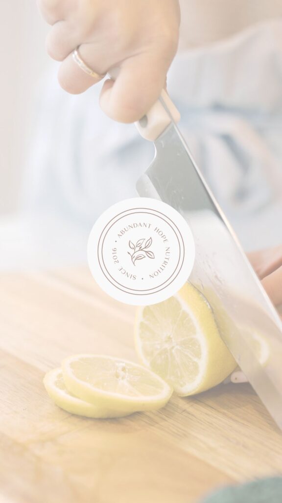
Additional patterns of monograms and leaf icons have more symmetry. The symmetry represents focus and preciseness. This balance of patterns reflects the duality in their work: approachable but expert.
“It’s worth the investment to bring your brand up to date. It will change the way you and others see your company for the better.”

Aubre Walther is the founder of Artisan Kind, a website and brand design studio specializing in Showit websites that feel true to who you are. As an official Showit Design Partner, she helps service-based businesses like coaches, wellness professionals, and consultants build websites that attract right-fit clients through authentic design. Working from her 100% solar-powered studio in Eau Claire, Wisconsin, she creates clean, intentional websites that make potential clients feel an instant sense of connection. When she’s not designing, you’ll find Aubre tending to her cats and celebrating the small wins.
Explore Showit templates and design services at artisankind.com.
Small business and website tips, branding advice, client projects, and occasional tips that help you build a life you love while growing a more joy-filled business.
Join the Email Community


Download my step-by-step guide to crafting an enticing lead magnet so you can attract, nurture, and convert an interested audience into ideal clients.
Lead your audience from loyal follower to interested audience member to future client.
Let's create a website you'll be excited to send them to.
YOUR NEW WEBSITE + BRAND AWAITS
Let’s invite them in, so they can experience the joy of working with you.
Are you ready for a website that shares your magic with the world?

