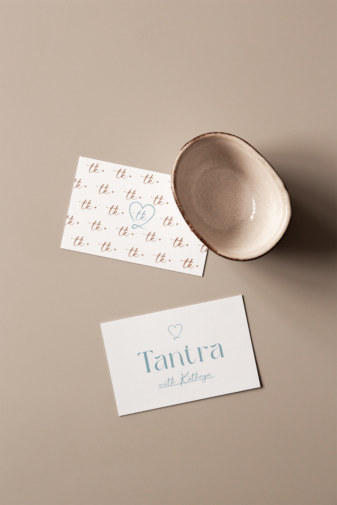
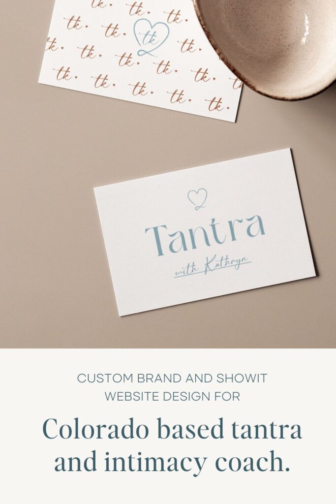
Custom brand and Showit website design for Colorado based tantra and intimacy coach.
Filed in Brand & Website Design
browse Business tips
explore my work
Categories
Small business and website tips, branding advice, client projects, and occasional tips that help you build a life you love while growing a more joy-filled business.
Join the Email Community
Expect small business, branding, and website tips, client website and brand projects, and occasional recommendations that help you build a life you love while growing your business — one filled with joy.
WELCOME TO THE WEB DESIGN + BRANDING BLOG FROM ARTISAN KIND
The Story:
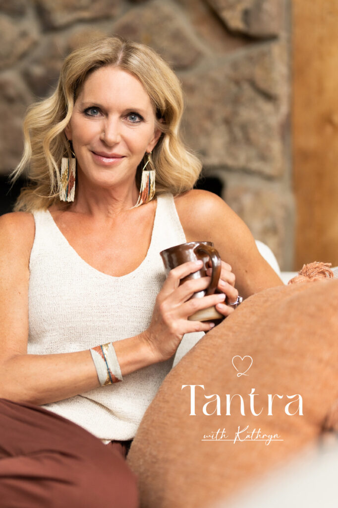
A fierce mother, a conscious partner and a soul seeking the nourishing touch of a life rooted in bliss. Kathryn Beachy weaves over 20 years of experience as a student and teacher of yoga with a decade of coaching in relationship transition and transformation.
With her new business she brings neo-tantric practices to individuals and couples who crave an intimacy that’s been hidden under life’s demands and societal narratives. She believes there is a divine thread between all things and it plays a large role in the mundane. She knows just how strongly that divinity can be felt in states of presence, joy and sacred union.
Kathryn reached out to breathe new life into her brand and website as she expanded her tantric offerings to in-person as well as virtual experiences.
The challenge:
We wanted Kathryn’s design to convey the following feelings:
- Approachable
- Alive
- Hopeful
The tantric topic can come with a lot of questions, misconceptions, and perceived expectations, but Kathryn was determined to make sure each client felt held and supported in their own unique intimacy journey. Never judged or attached to an “ideal relationship script.” She wanted to focus on the role of the individual and how developing a connection to self is what makes space for expansion in partnership.
Bearing this in mind we wanted to create a design that would feel like a spark of aliveness. Our goal was that website visitors would feel Kathryn’s warm invitation through the screen and feel connected to her approach before ever even meeting.
In this realm of vulnerable work, trust in your placeholder and coach is paramount. The website would need to feel like a safe and genuine place to explore before a potential client would decide to invest.


The transformation:
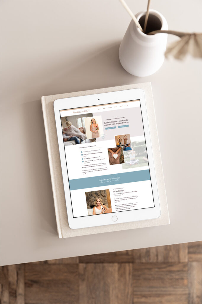
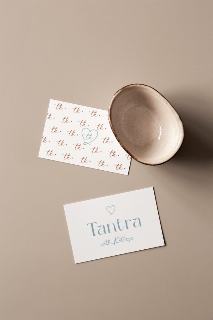
Kathryn’s brand identity features handwritten fonts and a full-of-life yet down-to-earth color palette of aqua blue, brown, and cream.
These elements, as well as her brand pattern of intertwining hearts, are used across her website to convey an approachable feeling.
The brand colors and flowing fonts mirror Kathryn’s own style choices (she favors neutral tones and flowy fabrics) which creates a subliminal link of trust for website visitors. Her home in the Colorado mountains (where she hosts private couples retreats) are also represented in her branding palette.
The website is spacious just as she hopes her client’s experiences are. It features full-header gifs of Kathryn interacting with her own partner as well as calm meditative postures that she leads couples through. The movement of the gifs compliments the soft, loving nature of her brand photos.
With her newly launched custom design Kathryn is excited to share fresh offerings with pride and confidence! The enhanced professionalism conveys even more warmth and safety to potential clients who have been searching for a deeper connection to life and love.

Aubre Walther is the founder of Artisan Kind, a website and brand design studio specializing in Showit websites that feel true to who you are. As an official Showit Design Partner, she helps service-based businesses like coaches, wellness professionals, and consultants build websites that attract right-fit clients through authentic design. Working from her 100% solar-powered studio in Eau Claire, Wisconsin, she creates clean, intentional websites that make potential clients feel an instant sense of connection. When she’s not designing, you’ll find Aubre tending to her cats and celebrating the small wins.
Explore Showit templates and design services at artisankind.com.
Small business and website tips, branding advice, client projects, and occasional tips that help you build a life you love while growing a more joy-filled business.
Join the Email Community
Download my step-by-step guide to crafting an enticing lead magnet so you can attract, nurture, and convert an interested audience into ideal clients.
Lead your audience from loyal follower to interested audience member to future client.
Let's create a website you'll be excited to send them to.
YOUR NEW WEBSITE + BRAND AWAITS
Let’s invite them in, so they can experience the joy of working with you.
Are you ready for a website that shares your magic with the world?
proudly designed in my 100% solar powered home studio
ARTISAN KIND LLC © 2024
proudly designed in my 100% solar-powered design studio | ARTISAN KIND LLC © 2025
Head Home
Meet your Designer
View Portfolio
Get In Touch
Book Discovery Call
Explore All Services
Custom Webs Design
Semi-Custom Web Design
Custom Brand Design
Shop Website Templates
Browse Favorite Resources
Free Website Assessment
Explore the Blog
Read Terms & Privacy Policy
Find Your Way Around
Small business and website tips, branding advice, client projects, and occasional recommendations that help you build a life you love while growing a more joy-filled business.
Email Community
join the
Every element of my website, copywriting, and designs has been thoughtfully crafted by real human hands and creative minds, ensuring your experience is personal, intentional, and authentically human!
An authentically human experience
Aubre Walther is a Showit Designer based in Eau Claire, WI, serving clients worldwide from a 100% solar-powered home design studio.
Creating websites & brands that make your potential clients feel an instant sense of connection and trust.