browse Business tips
explore my work
Categories
Small business and website tips, branding advice, client projects, and occasional tips that help you build a life you love while growing a more joy-filled business.
Join the Email Community
Expect small business, branding, and website tips, client website and brand projects, and occasional recommendations that help you build a life you love while growing your business — one filled with joy.
WELCOME TO THE WEB DESIGN + BRANDING BLOG FROM ARTISAN KIND
Mood boards serve a real purpose beyond being a pretty accent on an Instagram feed. Over 65% of the world’s population is made up of visual learners. That means 65% of people feel more connected to a concept when they can see it represented in front of them.
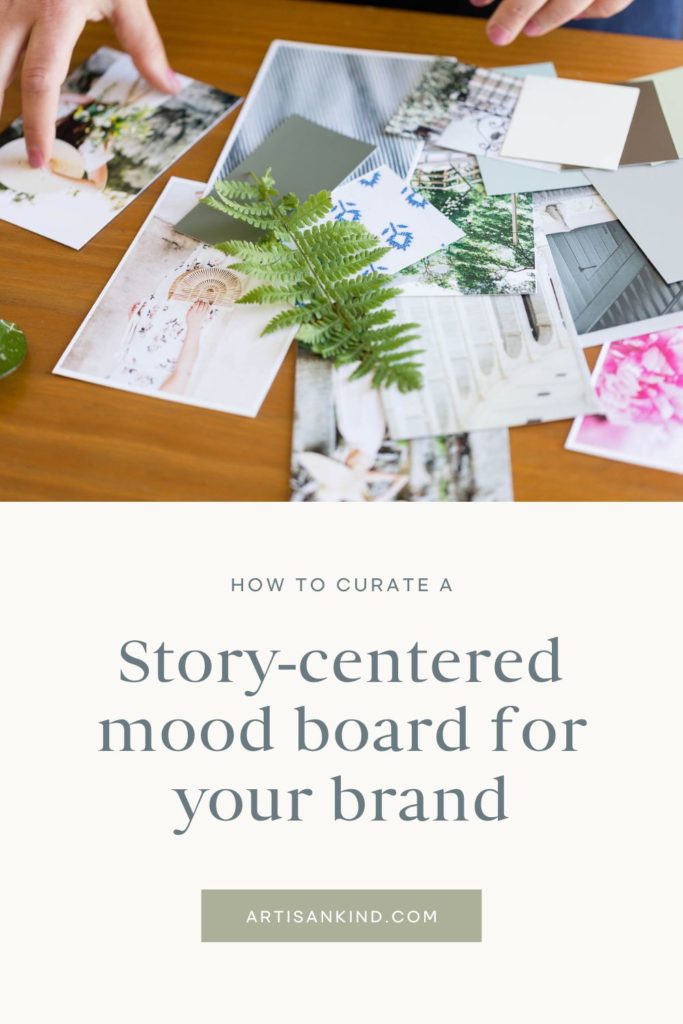
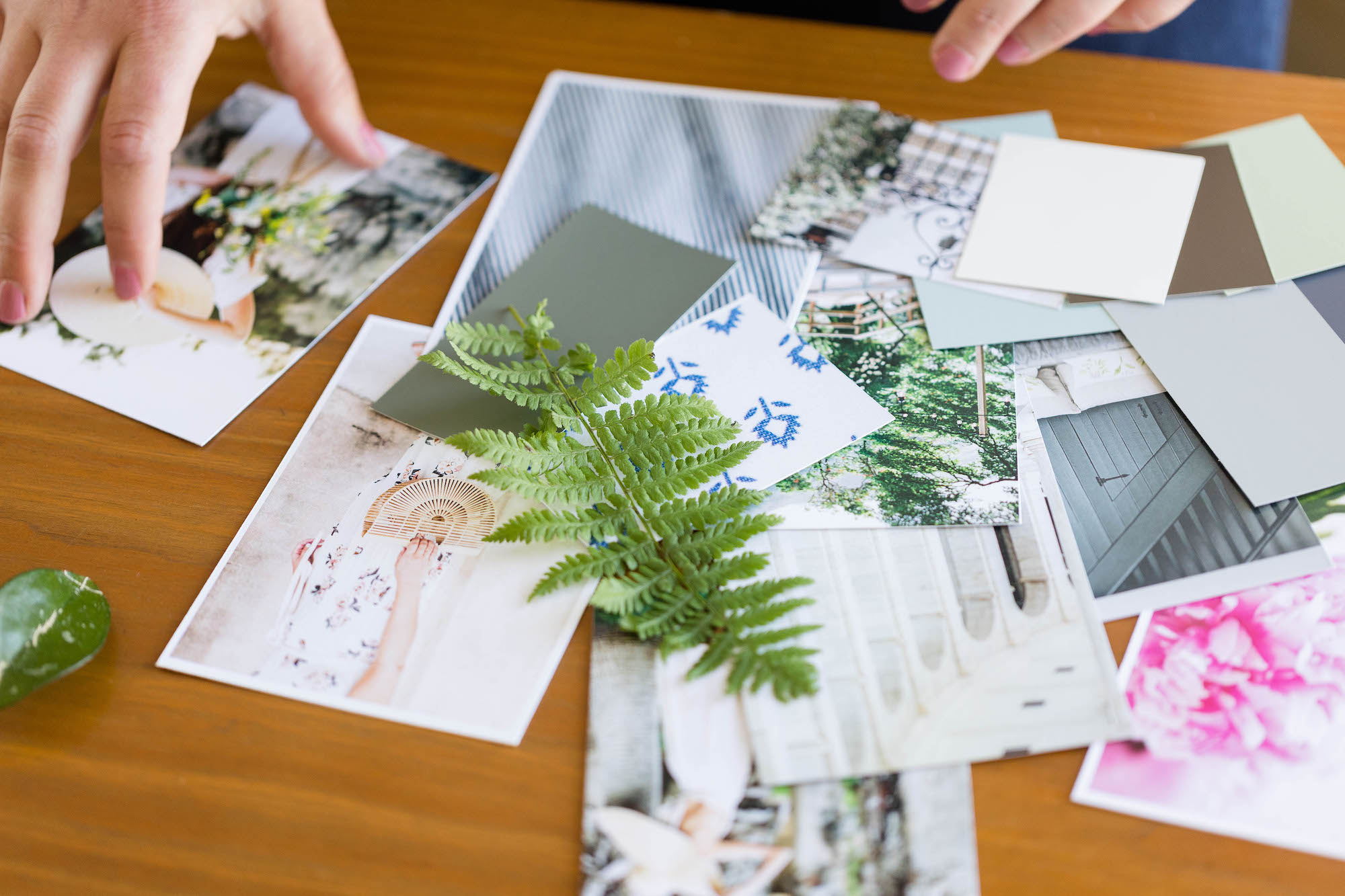
Whether it’s a brand project, a book idea, a photoshoot, an event, or an interior design adventure, a curated set of photos (aka: a mood board) can help us “set the scene.”
Today we’re going to explore what a mood board really is, why it’s so powerful (especially when it comes to brand design), and how you can curate an effective one rooted in storytelling.

THE POWER OF MOOD BOARDS
The definition of a mood board is: an arrangement of images, materials, pieces of text, etc. intended to evoke or project a particular style or concept.
Other definitions we like to use are:
- A window into your vision
- A representation of your brand’s heart
- The setting of your brand
A mood board can be digitally curated on a site like Pinterest (this is part of our journey with brand and web design clients), or physically in a notebook, or hanging on the wall.
You may be familiar with “vision boarding” which is a very similar concept that has more to do with goal setting. Mood boards are all about putting visuals to a feeling, a vibe, a tone, or an atmosphere you’re looking to achieve.
As we shared in this blog post, building a brand is a lot like building a fictional world. A brand is three-dimensional, an immersive experience that you invite your audience into. But what would this world feel like? Look like? What’s the important symbolism?
When you create a mood board you’re creating a door. A way to step into the world of your brand.
We’re often at a loss of words when it comes to describing our visions, (or at least, words seem to fall flat) it’s so much easier to SHOW what you mean.
When you’re working with a designer who asks you to curate a brand mood board, it’s not merely an extra step to fill time. It’s a way for you to share your vision with the designer so they’re not guessing on the overall atmosphere you’d like to achieve.
Mood board building is also a powerful way to break you away from “just pretty” design choices.
You might love a particular style of logo or color palettes…but a mood board helps you consider “why” you like that style? Does it give you a feeling that you think resonates with the world of your brand? Does it symbolize something that aligns with what you do?
Our client, Lauren Mudrock loved pineapple symbolism because they represented welcoming energy—something very key to her brand.
You’ll find as we go along that there is an art to mood-boarding, it’s not simply putting together images you like—it’s being intentional about the story you’re trying to tell. The scene you’re trying to paint.
HOW TO CREATE A BRAND MOOD BOARD
Now let’s talk about what to actually add to your mood board. If you’re a solo entrepreneur it’s likely your brand will share a lot of characteristics as your personality.
Ex:
- You love city cafe and latte art no matter how “trendy” it’s become
- Your a rustic, country soul who rocks jeans and cozy flannels
- You’re a introverted book lover who dreams of having a floor to ceiling bookcase…or maybe a whole library
- Your a bold and energetic presence who brings life to all your social gatherings
- You love a good spreadsheet and a color-coded, well organized space makes your heart race
- You’re happiest when you’re out exploring under a a shining sun and a blue sky, breathing in the wind and feeling earth between your toes
- You’re an equestrian through and through who would gladly spend your days in the stables or bareback riding.
- You were made for nighttime skies or rainy days or sunsets.
- You were made for winter, spring, summer, or fall
Sometimes it’s easier to start with imagining images that correspond with your personality. Make a list if that helps!
Afterwards you can decide how much of your personality will be infused into your brand identity and if there are any smaller personality traits of yours that don’t fit with your vision for your brand (while we encourage being the real you in your business, it’s okay to keep some things to yourself).
WHAT TO SEARCH ON PINTEREST ON PINTEREST
Pinterest is one of the easiest ways to create a personality-packed mood board. But what to type in to find the perfect images for your vision?
Using words like “aesthetic” “vibe” or “core” are great for finding niched images. Let’s look at some examples:
- “Grunge aesthetic”
- Fairytale aesthetic
- Slow living aesthetic
- Cafe aesthetic
- Forest aesthetic
- Farm aesthetic
- Home office aesthetics
- Writer aesthetic
- Yoga aesthetics
- Harry Potter aesthetics (this definitely went into our brand mood board…but you could substitute this with any book aesthetics you feel align with you)
- Sunrise vibes
- Sunday morning vibes
- City life vibes
- Equestrian vibes
- Rainy day vibes
- Pacific Northwest vibes
- Blue vibes (or any other color)
The word “core” is a popular suffix used to explain the main idea/vibe of something ex:
- Cottage core
- Fairy core
- Academia core
- Winter core (or any other season)
- Vintage core
- Rustic core
- City core
- Nighttime core
The key will be finding a few words for your brand personality and trying out combinations to find aligned images. It’s a fun little adventure, and believe us, you’ll get on a role once you start.
What to add: Symbolism
We think the easiest place to start with a mood board is symbolism. Consider those personality traits from above and start sifting through images that represent those traits:
Ex:
- A cup of coffee
- A stack of books
- A knitted blanket
- A lake sunrise
- A city block
- Barefeet
- Flowers/herbs
- A person walking through a setting you’d love to be in
- A horse bridle
- A planner
- A pair of glasses next to a laptop
- A pine forest
What to add: Color
After you’ve curated some symbolic scenes go back and try to pick out some themes in the colors of your images. Maybe you’ll realize you gathered a lot of images with blue hues, browns, dark tones, or very light and airy colors?
Notice how we didn’t suggest adding colors first…you may have a color in mind for your brand already, but what does that color actually mean to you? Does it truly align with the intended personality of your brand?
Once you’ve noted any recurring colors (and maybe you didn’t see a pattern, that’s okay) it’s time to start gathering images with color swatches that you envision for your brand.
If you’re working with a designer then they will help you identify color trends within your moodboard. Adding colors on your own will help your designer see what you’re drawn too.
Consider a combination of colors including:
- Main Colors
- Neutrals
- Accents (tend to be more bold and used sparingly)
What to add: Texture
Finally with symbolic and colored images, go back again and see if you can pick out any texture patterns.
Maybe there’s a lot of images with a linen or canvas texture? Earthy textures like grass, foliage, or bark? Grungy brick, metals, or pavement? Fog, mist, tulle, satin, wood, stucco, paint, dreamy light, deep shadows etc.
Once you’ve noted any textures in your previous images you can go searching further into those styles and add some pictures with that texture at the forefront.
STORYTELLING: THE COMMON THREAD
A quality moodboard is one that tells a story. One that you can scroll through and find cohesive threads…colors, textures, and symbols that could all exist in the same world. A sense of harmony.
We encourage you to go through you mood board once you’ve collected a variety of images and reflect:
- How does it feel to you and could you put words to the collection of images you now have?
- Do these images make you want to step through the screen?
- If you had to give this mood board a story genre what would it be?
- Mystery
- Fantasy
- Action/adventure
- Contemporary
- Romance
- Comedy
- Historical
- Suspense
- Self-help
- Art
- Food and drink
- Home
- If your brand were a book and your ideal clients saw these images only, would they want to read your book?
- Could your ideal clients relate to these images? Could they see themselves as a character in this “book”
If you’re unsure about any of your answers you can go back and try to discern where the disconnect is. Maybe your moodboard is missing a key element that resonates with both you and your ideal clients. Maybe there’s too much of one feeling and not enough of another.
Play around to balance out the overall tone.
WHAT TO DO WITH YOUR MOOD BOARD
Maybe you’re creating a mood board as a homework assignment for you to work with a brand designer already. If so, it’s time to share it with them! Feel free to let them know if you struggled to find images for any particular feeling so they can collaborate with you.
If you created a mood board for your brand on your own, what can you do with it now?
- Use it to search for a brand designer. Can you find one that seems to have a style that aligns well with your board?
- Use it to enhance your copywriting and brand messaging. Is there language or a tone of voice that you could be using in your content or on your website that aligns better with the style of your brand? Maybe this helps you find your brand voice.
- Use it to find a website template. If you’re not yet ready to invest in custom website design then a template is a great place to start! The best template is one that is already built with your vision in mind (that way you don’t have to re-edit the entire thing to feel the way you want it to…work smarter, not harder) !
- Use it to DIY some brand photos. Photographers use moodbrads all the time to plan their shoots. You can use your mood board for inspiration on props, settings, and even camera angles to take some fresh photos for your brand content.

Aubre Walther is the founder of Artisan Kind, a website and brand design studio specializing in Showit websites that feel true to who you are. As an official Showit Design Partner, she helps service-based businesses like coaches, wellness professionals, and consultants build websites that attract right-fit clients through authentic design. Working from her 100% solar-powered studio in Eau Claire, Wisconsin, she creates clean, intentional websites that make potential clients feel an instant sense of connection. When she’s not designing, you’ll find Aubre tending to her cats and celebrating the small wins.
Explore Showit templates and design services at artisankind.com.
Small business and website tips, branding advice, client projects, and occasional tips that help you build a life you love while growing a more joy-filled business.
Join the Email Community
Download my step-by-step guide to crafting an enticing lead magnet so you can attract, nurture, and convert an interested audience into ideal clients.
Lead your audience from loyal follower to interested audience member to future client.
Let's create a website you'll be excited to send them to.
YOUR NEW WEBSITE + BRAND AWAITS
Let’s invite them in, so they can experience the joy of working with you.
Are you ready for a website that shares your magic with the world?
proudly designed in my 100% solar powered home studio
ARTISAN KIND LLC © 2024
proudly designed in my 100% solar-powered design studio | ARTISAN KIND LLC © 2025
Head Home
Meet your Designer
View Portfolio
Get In Touch
Book Discovery Call
Explore All Services
Custom Webs Design
Semi-Custom Web Design
Custom Brand Design
Shop Website Templates
Browse Favorite Resources
Free Website Assessment
Explore the Blog
Read Terms & Privacy Policy
Find Your Way Around
Small business and website tips, branding advice, client projects, and occasional recommendations that help you build a life you love while growing a more joy-filled business.
Email Community
join the
Every element of my website, copywriting, and designs has been thoughtfully crafted by real human hands and creative minds, ensuring your experience is personal, intentional, and authentically human!
An authentically human experience
Aubre Walther is a Showit Designer based in Eau Claire, WI, serving clients worldwide from a 100% solar-powered home design studio.
Creating websites & brands that make your potential clients feel an instant sense of connection and trust.
